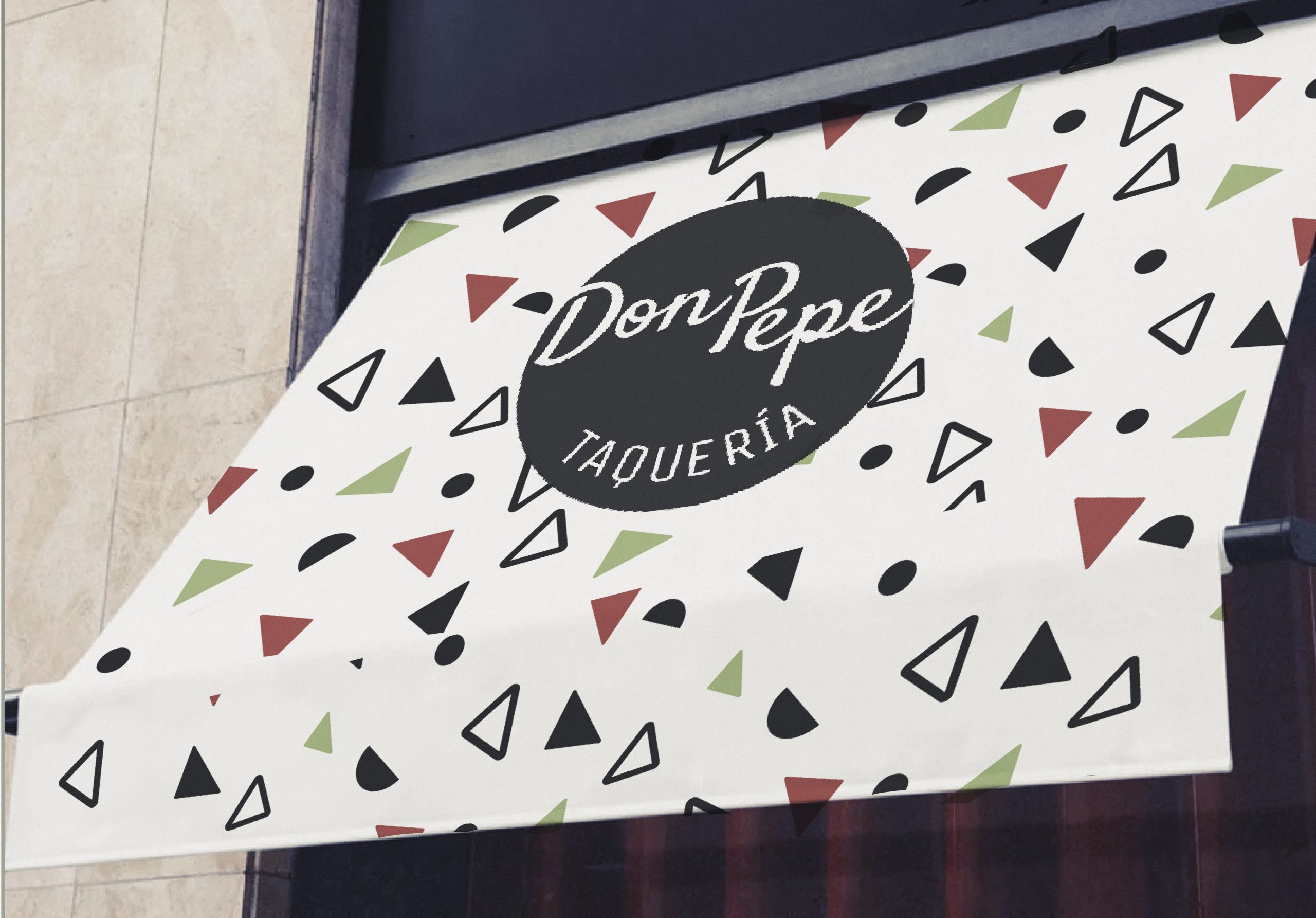
The corporate identity was developed for a family-friendly Mexican restaurant located in the city of Porto in Portugal.
The logo is a cartoon representation based on the bespoke illustration of Don Pepe a character who was born and intended to portray an intimate, relatable and familiar expression that conveys joy and tenderness. The brand also have a handwriting typography that simulates his signature. A Logo, Patterns, Food and Drink Menus, Business cards, Website and Staff Uniforms were all included in this project.


Ready to elevate your brand with custom graphic design solutions?
Drop me an email if you’d like to work with me or just fancy a chat!


